
I wanted a logo for my refreshed blog — something that fit the new vibe, stood on its own, and, importantly, was a clean, scalable vector. Naturally, I started with monogram ideas. They were fine… but they weren’t me. They felt a bit too neat, too corporate, too “someone else’s studio.”
Then I started thinking about writing, pens, and the Chronicle theme. I glanced through my TPT image assets and spotted a feather. That’s when the idea clicked: an old‑fashioned quill doodling a modern SLOAH logo. A little juxtaposition of old and new. A logo within a logo. Slightly Inception‑ish. And very me.
I sketched a simple feather in GIMP, then moved into Inkscape to position everything until the quill and the SLOAH swirl felt like they belonged together. And then came the node cleanup. So. Many. Nodes. I swear Inkscape generates them out of spite.
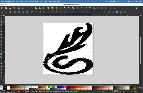
But after a lot of nudging, pruning, smoothing, and muttering at my screen, I finally ended up with a logo I’m genuinely happy with — one that feels warm, creative, and a little playful.
I hope you like the end result. Blog, sketch, and tears — to paraphrase.

Comments